
How to Data Viz like a Pro Part 1
/How to Data Viz like a Pro Part 1
Episode 009
If a picture is worth a thousand words, then a data visualization must be worth far more than that - Dave Mathias
If a picture is worth a thousand words, then a data visualization must be worth far more than that.
People respond to pictures. There’s an emotional reaction that drives action and decisions. Black & White numbers on a page will only take you so far in making your users actually do something!
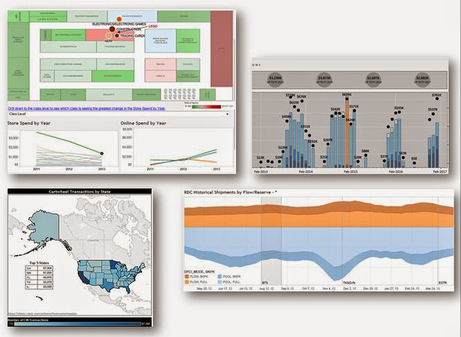
In Episode 1 of this two part series, we talk about the the two core ways that dataviz can help. The first is Dataviz for exploring your data. Using tools like scatterplots and small multiples will help you find the outliers… to FIND the story that needs to be told in your data. But these don’t do a great job of quickly and easily telling your story. You have to search for the answer.
That’s why there’s a second type of dataviz that we want to discuss… specific for telling a compelling story. Maps, bar charts, and line charts are going to be your bread and butter here.
We also talk about the importance of communicating precision, confidence, or error bands and the various ways that you can help the reader understand how accurate your data might be.
For inspiration, we encourage you to check out Storytelling with Data by Cole Nussbaumer-Knaflic, and Makeover Monday by Andy Kriebel and Eva Murray. They have tons of great content on how to think about (and practice!) good data visualization.
Next week’s episode, we’ll talk about some of the risks in using visualization to easily mislead or lie to your data consumer.