
How to Data Viz like a Pro Part 2
/Listen to the Episode
Subscribe to the Podcast
Episode Summary
If a picture is worth a thousand words, then a data visualization must be worth far more than that.
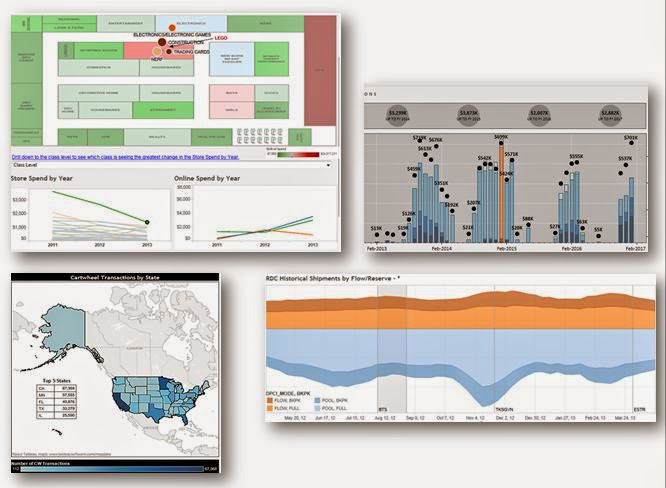
In Part 1 of our two part series on data visualization, we talked about GOOD visualizations, what types of visualizations work better, when to use them and the like.
Today we’re talking about BAD visualization. When data viz goes wrong. And of course we have to start with the PIE CHART. As a wise friend once told me, “If a chart is named after food, then I don’t like it”.
If a picture is worth a thousand words, then a data visualization must be worth far more than that - Dave Mathias
We know lots of people don’t feel the same way about pie charts, so we wanted to discuss a bit about WHY it’s not a great tool for helping you tell your data stories. We won’t say you can’t use it, but make sure you know what it does and doesn’t do well. We’ll also hit on the “Data to Ink Ratio” which was pioneered by Edward Tufte and look at the pie chart on this ratio scale.
Finally, we wanted to talk about DESIGN when it comes to data visualization. Design doesn’t have to be colorful or frilly. Design can actually be minimalistic and utilitarian in form and function. The goal here isn’t to say that one is better than the other, but to ensure you’re thinking about your audience and how you want them to act after seeing your visualization.
If you’re creating something public and want lots of Shares, Re-Tweets and Likes, then a more infographic approach can work well. If you’re creating something for your CFO, tables, numbers and no-frill visualizations are probably a better way to go.
Resources and Links
Some great resources that can help you get started are Storytelling with Data by Cole Nussbaumer-Knaflic, and Makeover Monday by Andy Kriebel and Eva Murray.